

C-15 3rd Floor, Amar Colony Main Market,
Lajpat Nagar - 4,
New Delhi - 110024, India
 Bootstrap
We are team of talented designers making websites with Bootstrap

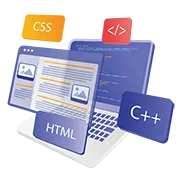
Bootstrap is a free, open source front-end development framework for the creation of websites and web apps. Designed to enable responsive development of mobile-first websites, Bootstrap provides a collection of syntax for template designs.
As a framework, Bootstrap includes the basics for responsive web development, so developers only need to insert the code into a pre-defined grid system. The Bootstrap framework is built on Hypertext Markup Language (HTML), cascading style sheets (CSS) and JavaScript. Web developers using Bootstrap can build websites much faster without spending time worrying about basic commands and functions.

Bootstrap often comes into the picture when speed matters. Teams want to move quickly, get interfaces in place, keep things consistent without building everything from scratch. At first, it works well. Layouts fall into place, components behave predictably. But over time, small adjustments begin to stack up. Overrides here, custom styles there. What started as a structured system can slowly become harder to manage. We’ve seen cases where the framework did its job early on, but later started to limit flexibility. Design changes become trickier. Performance needs a closer look. Even alignment with a custom design system can feel forced. In practice, decisions around Bootstrap tend to connect with broader frontend choices. How much of the framework to keep, what to extend, what to refactor. It’s rarely just about the framework itself. That’s usually when the scope shifts slightly. Not towards replacing everything, but towards making sure the setup still supports how the product is evolving.


Some teams start with Bootstrap because it helps them move quickly. Layouts, grids, components all in place, enough to get a working interface out without too much delay. Others come in after that initial phase. When the structure is there, but customisation has started to feel uneven. Styles overridden in multiple places. Components behaving slightly differently across pages. We’ve worked with early-stage products that relied heavily on the framework, and also with more mature platforms where Bootstrap was just one layer among many. Different setups, similar questions around consistency and control. In a few cases, the requirement was straightforward. Keep the framework, clean up the implementation. In others, it was more open. Understanding where the framework still fits, and where it starts getting in the way. What tends to stand out is the balance. Between speed and structure on one side, and flexibility on the other.
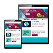
Bootstrap is the standard for "mobile-first" design. At JIL, Bootstrap is used to ensure your website layout is consistent across all devices. This prevents your website from "breaking" on different screen sizes. Our tech team uses it to speed up development without sacrificing custom looks and quality.
Not at all. While Bootstrap provides the structure, our design craftsmen & craftswomen heavily customize the CSS to match your brand. We don't just "plug and play" code; we skin it and modify the components so your site feels unique. JIL ensures you get the stability of a framework with a 100% custom identity.
Yes, if handled correctly. Many developers bloat their sites by loading the entire library. JIL’s technical team only includes the specific "features & functionalities" your project needs. By stripping out the unused scripts, we keep the site lean & fast, which is crucial for your SEO rankings.
Absolutely. JIL tech team can convert or migrate your content into a fluid Bootstrap grid. This is the quickest possible way to modernize an outdated website and make it accessible to mobile users.
That is one of its biggest strengths. Since it’s a globally tested framework, it handles the "heavy lifting" for different browser versions. JIL technical team further tests the "touch-points" and alignments on Safari, Chrome, and Firefox to ensure a seamless experience for all your visitors.
Stop overthinking the technical structure! Let’s just talk it over a cup of tea or coffee. Tell us about your "design & functionality" requirements, and our tech craftsmen will map out the grid logic. Just high-performance, mobile-ready code that works for your business.